Marcellus Hall Illustration process. This is also from www/drawger.com
http://www.marcellushall.com/
CHILDREN'S BOOK ILLUSTRATION
posted:
Illustrating for Abrams a children's book about a teacher and her students traveling the world. Below are steps in the process of illustrating a 2-page spread. Chad Beckerman is the art director.
Sketch (on 9x12" sketch paper) keeping in mind where two lines of text will be and the "gutter" (where the two pages meet)
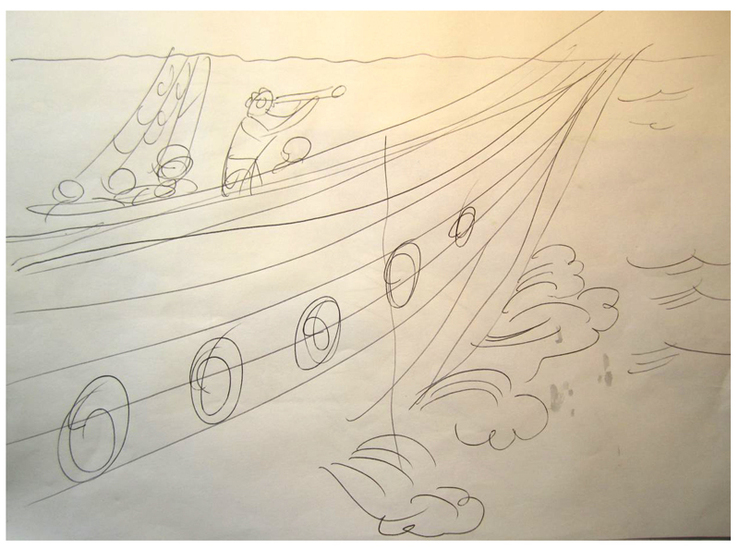
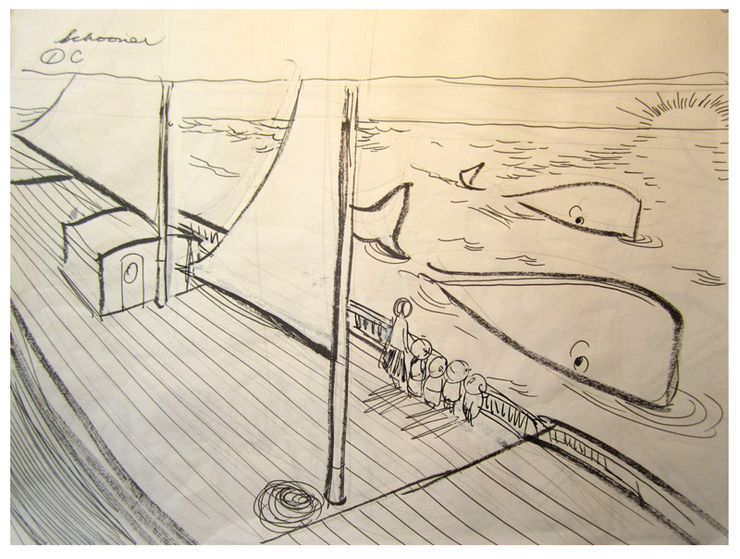
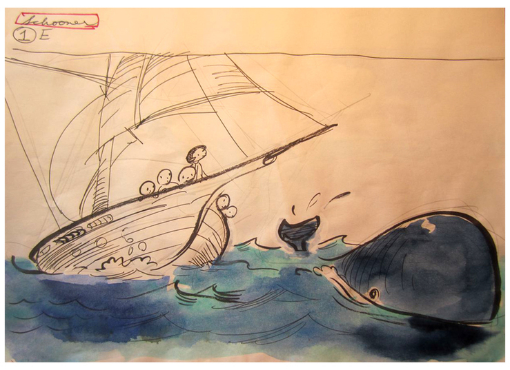
Sketch 2
Sketch 3
Sketch 4
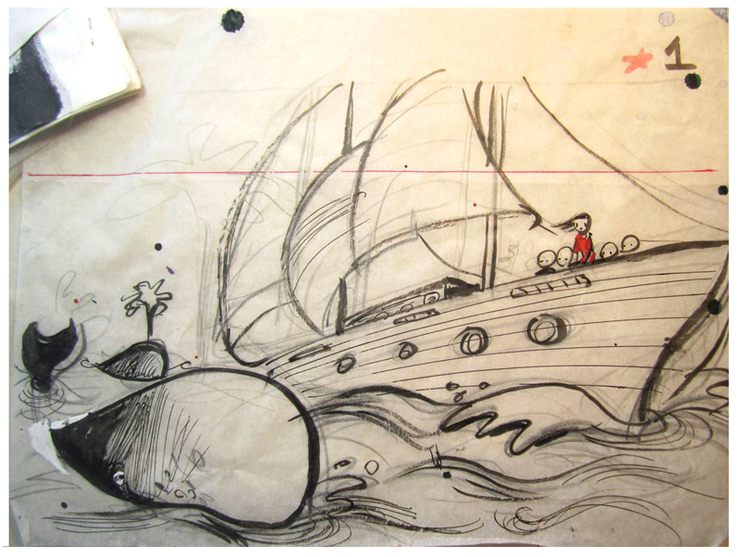
Sketch 5
Sketch 6
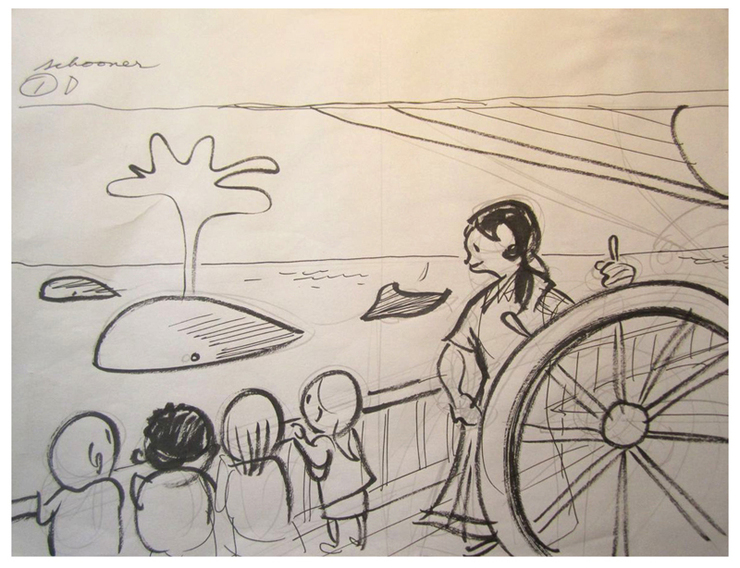
Sketch 7 - the chosen sketch.
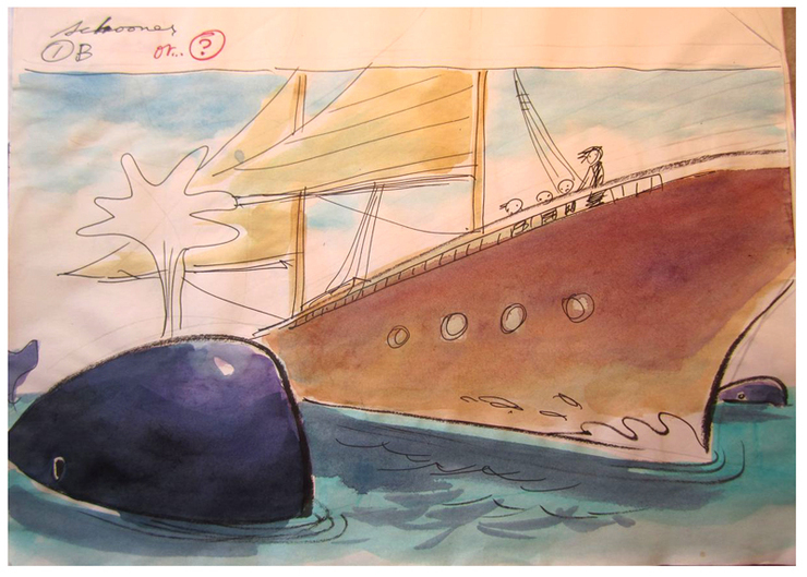
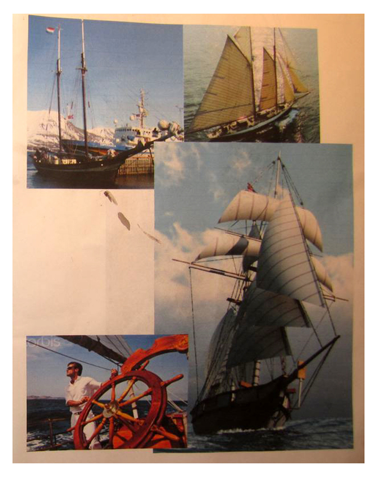
Reference
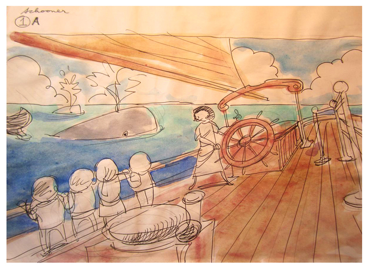
Color study
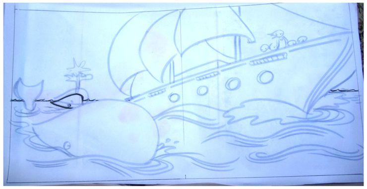
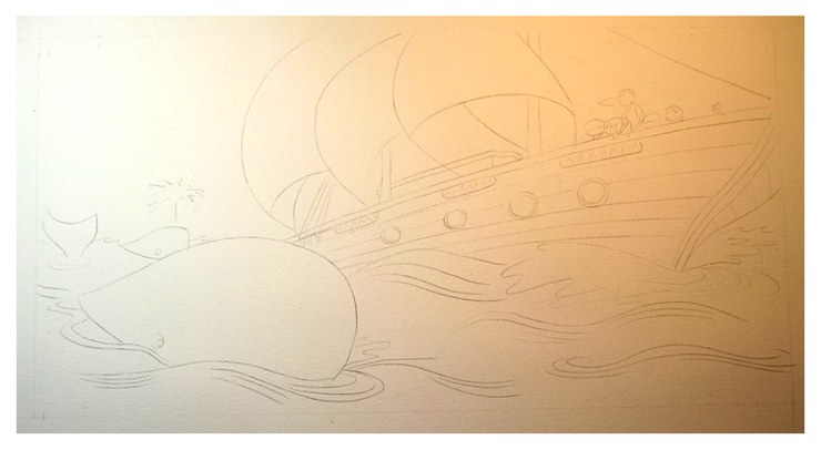
Enlarged line drawing on 20x10" vellum
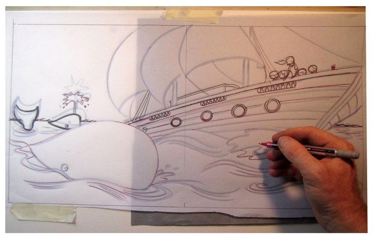
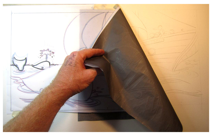
Re-drawing vellum image onto Arches 140lb cold-pressed watercolor paper using graphite transfer paper
Graphite drawing on watercolor paper
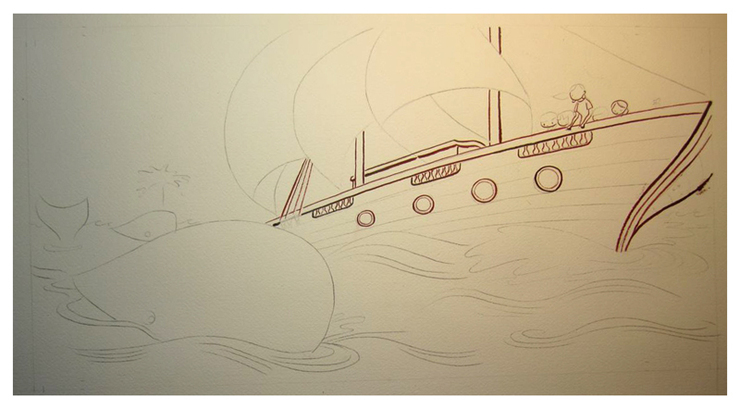
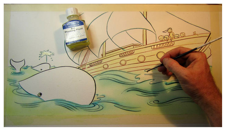
Applying waterproof brown "Calli" ink with No.2 Utrecht 228 Series Sablette brush
Adding dark blue lines - a mixture of Dr. Ph Martin's concentrated watercolor, Speedball Super Black India ink, and water
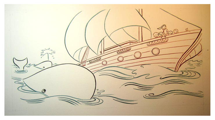
Applying masking tape to the sides and a thin layer of yellow watercolor to specific areas
Adding masking fluid to areas that will stay white (like the whales' eyes and certain waves) (masking fluid is rubbed off later with an eraser)
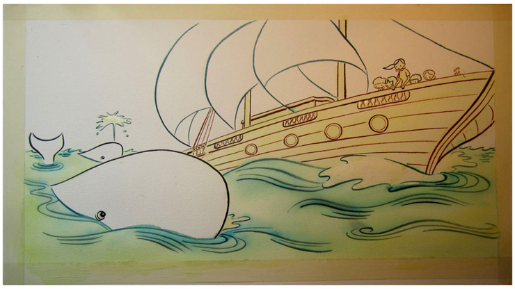
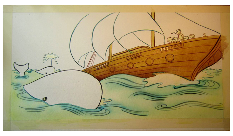
Brown watercolor on the boat
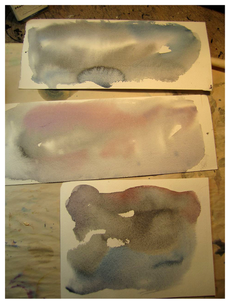
Practicing skies
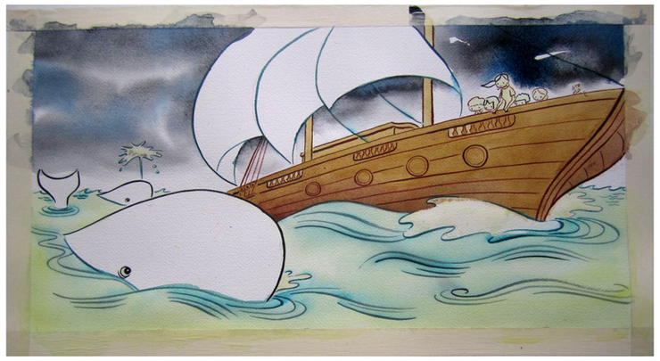
Sky
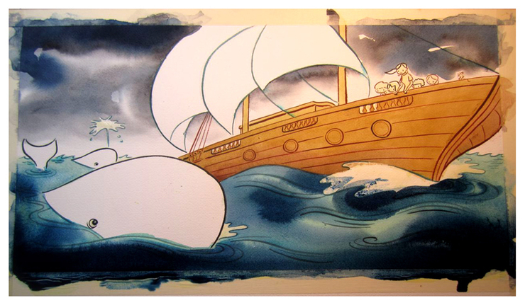
Water
More water (wet on wet)
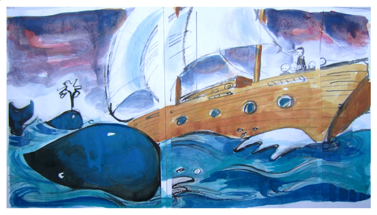
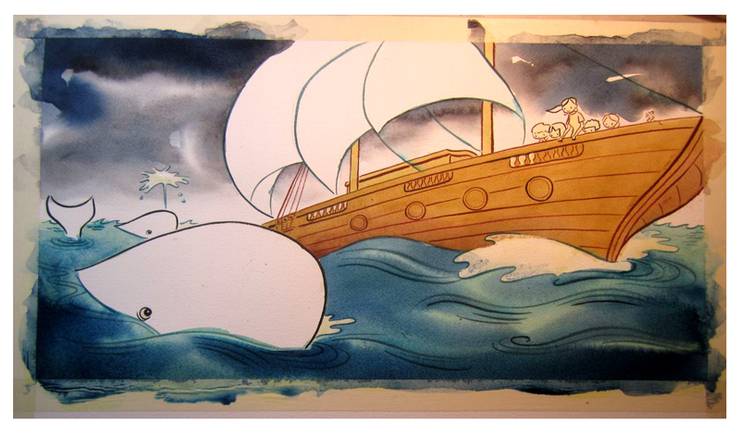
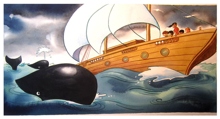
Whale
Other whale, teacher, and students
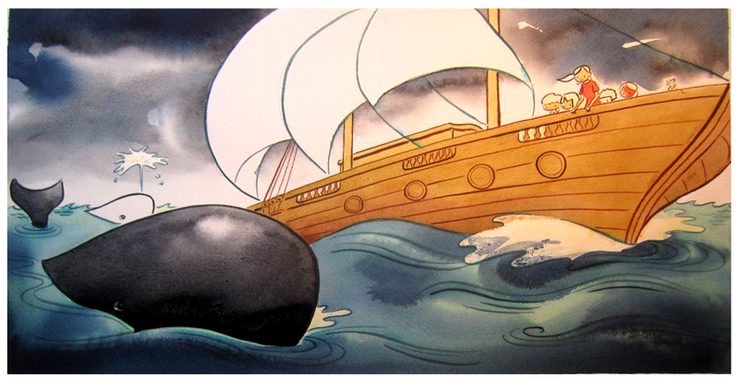
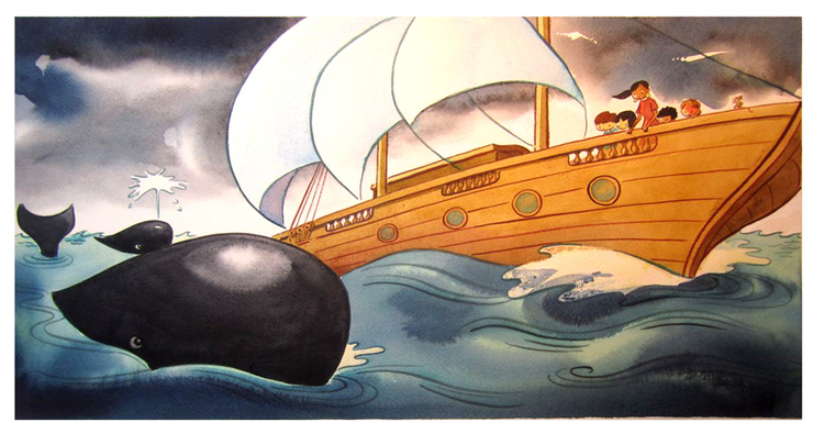
Erasing masking fluid, adding white gouache highlights, and darkening the whale - done for the time being... 12 or 13 more spreads to go
I have always loved Bill Mayer, his illustrations and concepts are beutiful and really smart.
Original link:http://drawger.com/billmayer/?section=articles&article_id=12620
web site: http://drawger.com/billmayer/?section=articles&article_id=12620
Creative Carnival
posted:
Sometimes something just lands in your lap with so much potential. When you have a client that is open for you to do anything you want, and an audience of your peers that will surely thumb their nose at anything sub-standard, you can't help but panic a little at first; right? This little poster was just so much fun from the very beginning, it was hard to see it all come to an end. Much thanks to all of the folks at Workbook for giving me the freedom to take this wherever it ended up falling. For me, I am much more used to heavy-handed art direction, so this "Do-whatever-you-want" theme I have been getting lately is just such a joy. But also hard to settle down in any one direction. No art director, no writer... Just do whatever you like.... How much fun this would be....
I did the normal thumbnail blast of overthinking directions and came up with four ideas that I thought worked pretty well. So, I comped those up and shared them with Alison. She warned me not to show so many ideas; that although they will enjoy seeing the process, they will not understand them and probably take me off in a direction I really don't want to go in. So we talked about them, and she said, "Do what ever you want...." This is still so hard for me, making decisions on what or where to go with a project so I decided to keep working on them and flush them out and sooner or later one would immerge as the right direction. I took the candidates and ran them by my normal group of internal critics and they like three, which I took a little farther toward the final poster. I wrote some copy and put together some type to give it that Carny feel...finally the two that were working both worked so well I figured either one would make a great poster so Sent them off to the "Reply all" group for feedback. They were split on wich one to go with but now offered some input (yes, of course, never too late for changes) on copy. Adding the performers and free drinks and victuals...( I had to look up victuals...)
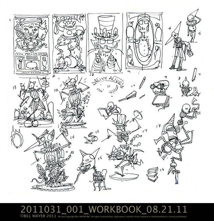
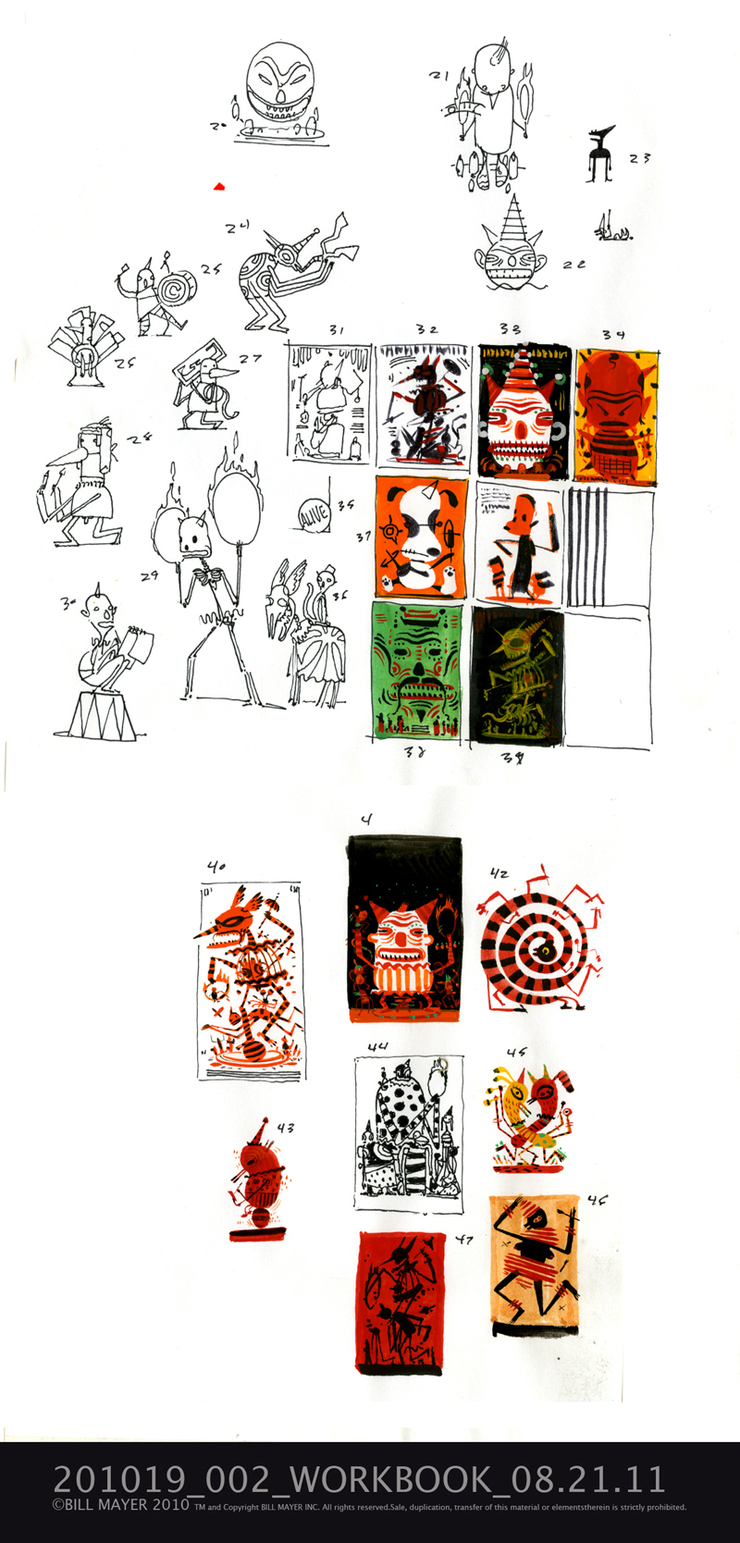
Here are the first set of thumbnails i did trying to get some handle on style a direction
I always loved Carney's, the dark, sort-of seedy side of those traveling freak shows and circuses that we were exposed to early in life. We had a travelling fair that would come through our town every year. I remember those so vividly. There was a great little movie version of a Ray Bradbary story, taken from a line in Shakespeare..."Something Wicked This Way Comes" This was a pefect visual inspiration for the feeling of those old Carneys that I remembered. When we were in art school at Ringling, there were lots of old circus performers that lived in the Sarasota area. It was not uncommon to pass them sitting on the porch of an old boarding house... a dwarf and a fat lady, just sitting, enjoying the day.
This stuff has so much great texture. Lee and I collected victorian taxidermy animal freaks for a while . You know Chickens being ridden by squirrels with a little whip... Vampire mice with little capes, animated birds.... There is a great little shop, I think it was called Shoefer's on 31st between 6th and 7th Avenue in New York where we found a standing goat who's penis flies out when you pull his tail. Yeah I know silly stuff to lay around the house, but fits right in with our gypsy junk. Shoefer's is a glass eye sales and taxidermy rentals, bizarre little place that we frequented to buy strange and mostly damaged dead things out of the basement.
second set of thumbs, tied a few little color studies, Liked number 44....33, love this little character on 29...gotta think of a way to use him...
took some of the four directions and did a little tighter thumbnail and added type. these little guys are about an inch and a half tall...
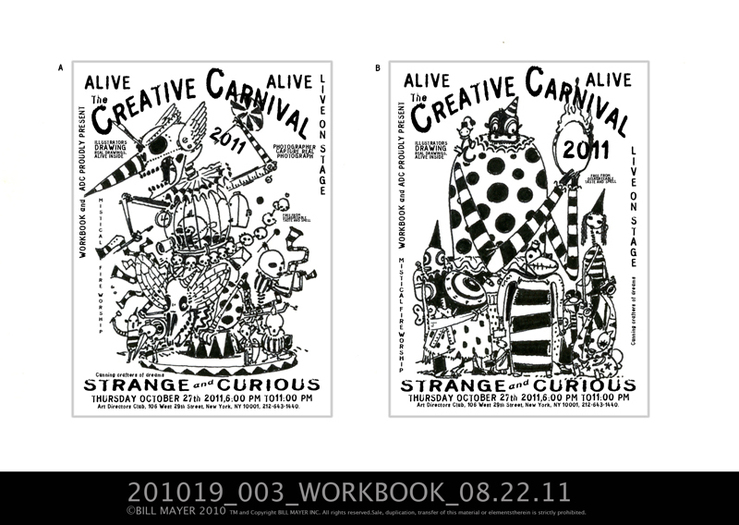
Just trying to get some direction from the client as to where they want to go...unfortunately I liked them all... I did my usual poll of friends to see which ones they liked and decided to keep working on three of them.
I don't know seemed like just too much color. I liked this version better in the thumbnail...
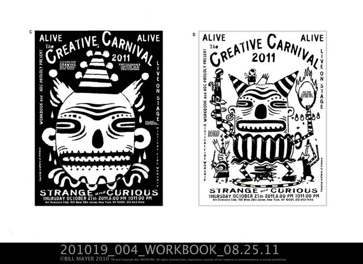
I really loved the Black and white drawings, and tried leaving it that way. added subtle colors and distressed the drawing... actually, I still like the limited color..
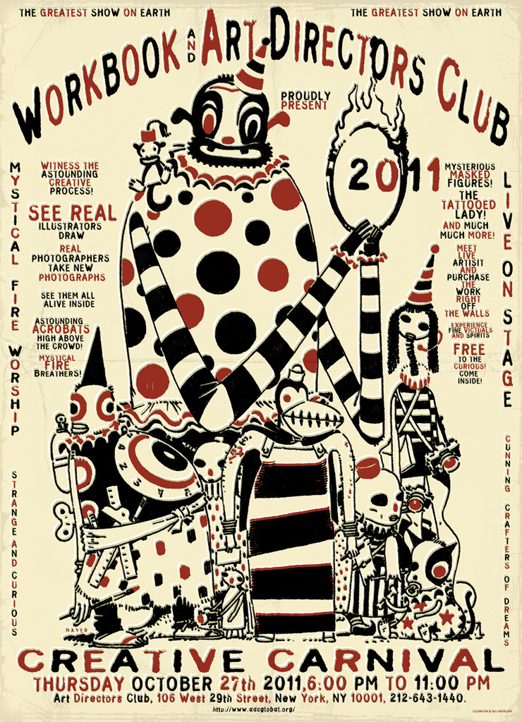
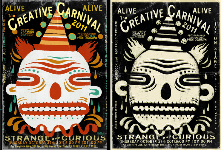
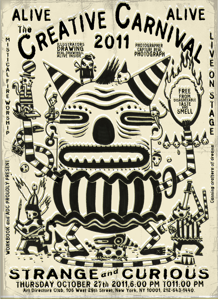
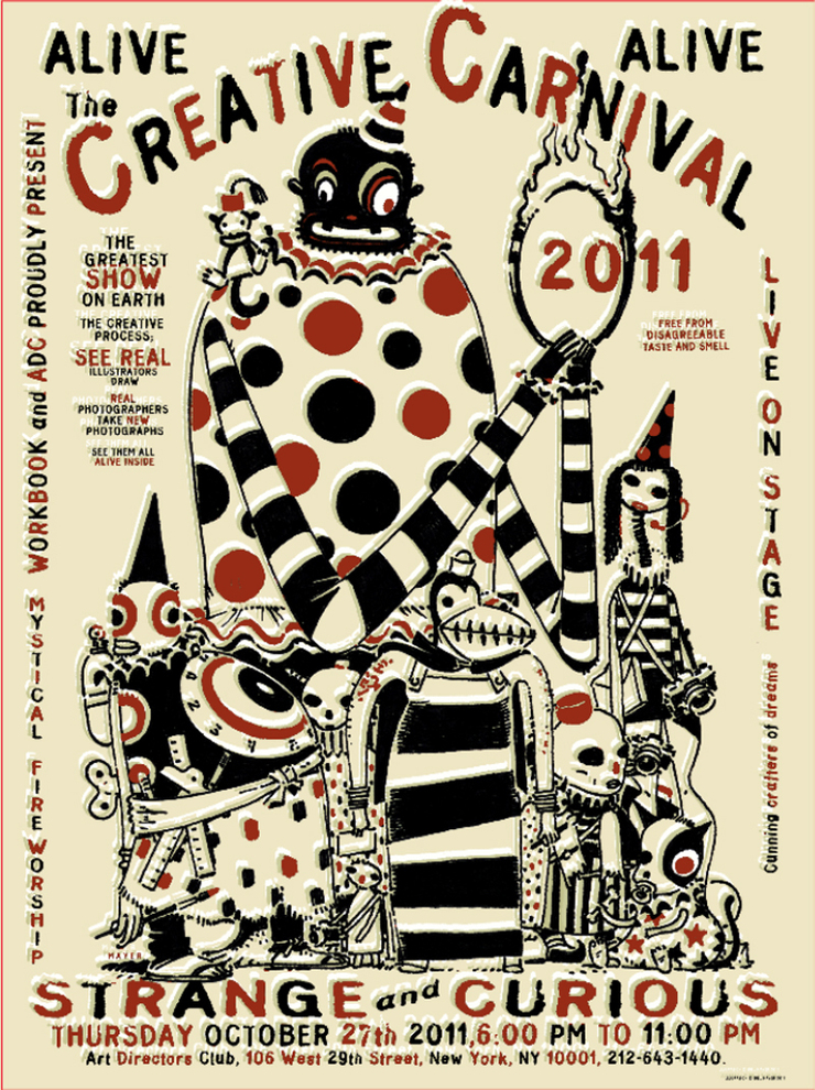
Here is the final poster I sent for approval...I wrote some copy to give it a "Carny" feel. Seemed like it needed a second color. Red and black always work...
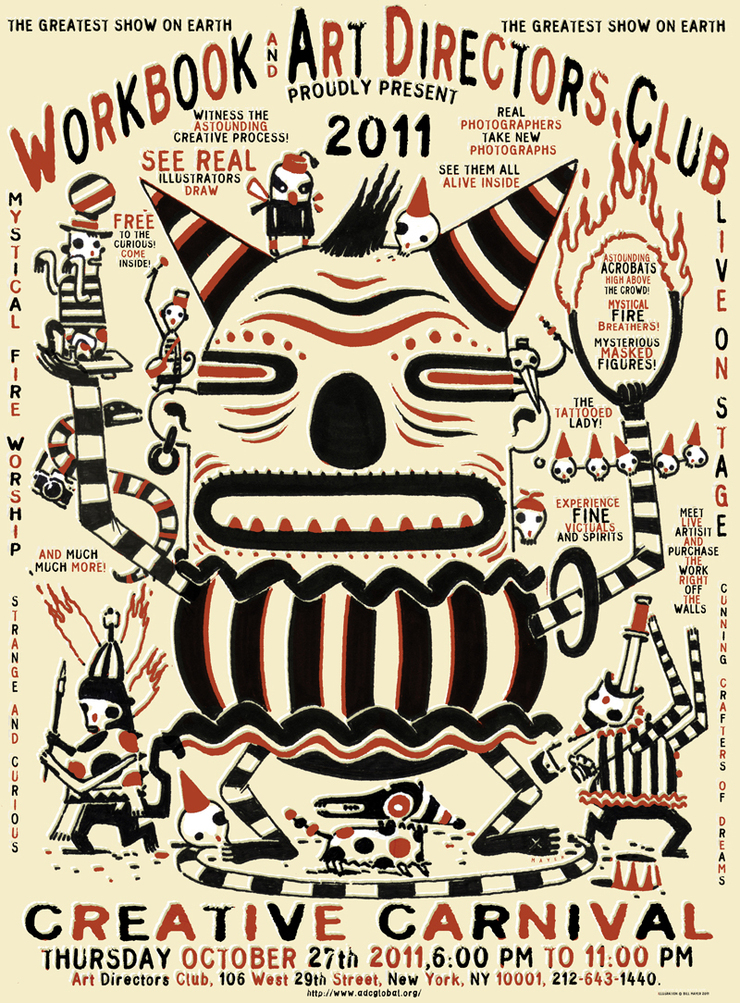
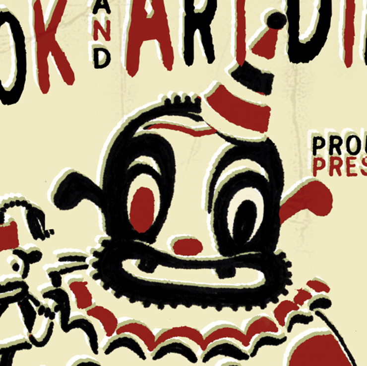
Beagle Boy to replace the Black faced clown...
So I didn't have an art director on this project until the very end and then seemed like everyone had something to say about it. Less type might be better.(Like I designed it originally, before you added all of the type?) Okay, let's bounce it off a few art director friends i know.mThey all say more type is better so the type stays... I am off on other projects. Honestly, I killed myself on this one by doing multiple versions of the same poster. Live and learn... and finally, the black faced clown had to go.... I loved that silly black face so it was hard to let go of this... But I had already been warned by both Lee and Alison that this would be a problem. The black face I never saw as a black person, but a way to bring some solid weight into the top of the illustration... But Black-faced Clown has to go. Finding a replacement I liked as much took a few tries. Seemed like Beagle Boy would do the trick....and he did work just fine.... Still awaiting a decision on which direction they will go with, but I like both of them, so either way I will be happy.
Projects like this are always so fun, it's hard to settle down and just do one version. They don't really come around that often and somehow you just really don't want them to end. Thank God for deadlines to help them out the door and help folks make final selections. Big thanks to Alison and the folks at WorkBook.